PROJECT OVERVIEW
Redesign a high converting website and make improvments for DirectFabric ( www.direct-fabrics.co.uk ) – Curtain & Blind Manufacturers. The company requires the layout to be functional, strong and clear. Needs to have the header mobile responsive.
For home page, category should be specific. Potentially straight to company’s best selling products.
Header needs modernising and needs to work well on mobile. Redo the top and side bar filters.
Core elements for each page and clear content. Product page should have clear structure and contents.
Pic. White Fabric
COMPETITIVE AUDIT
As the range of users is not homogenous and it is difficult to find suitable users to test with, plus the company has given websites of competing companies and presented their preferences for these sites and what they consider to be flaws. So I conducted a complete competitive audit to analyze and find out the room for improvement.
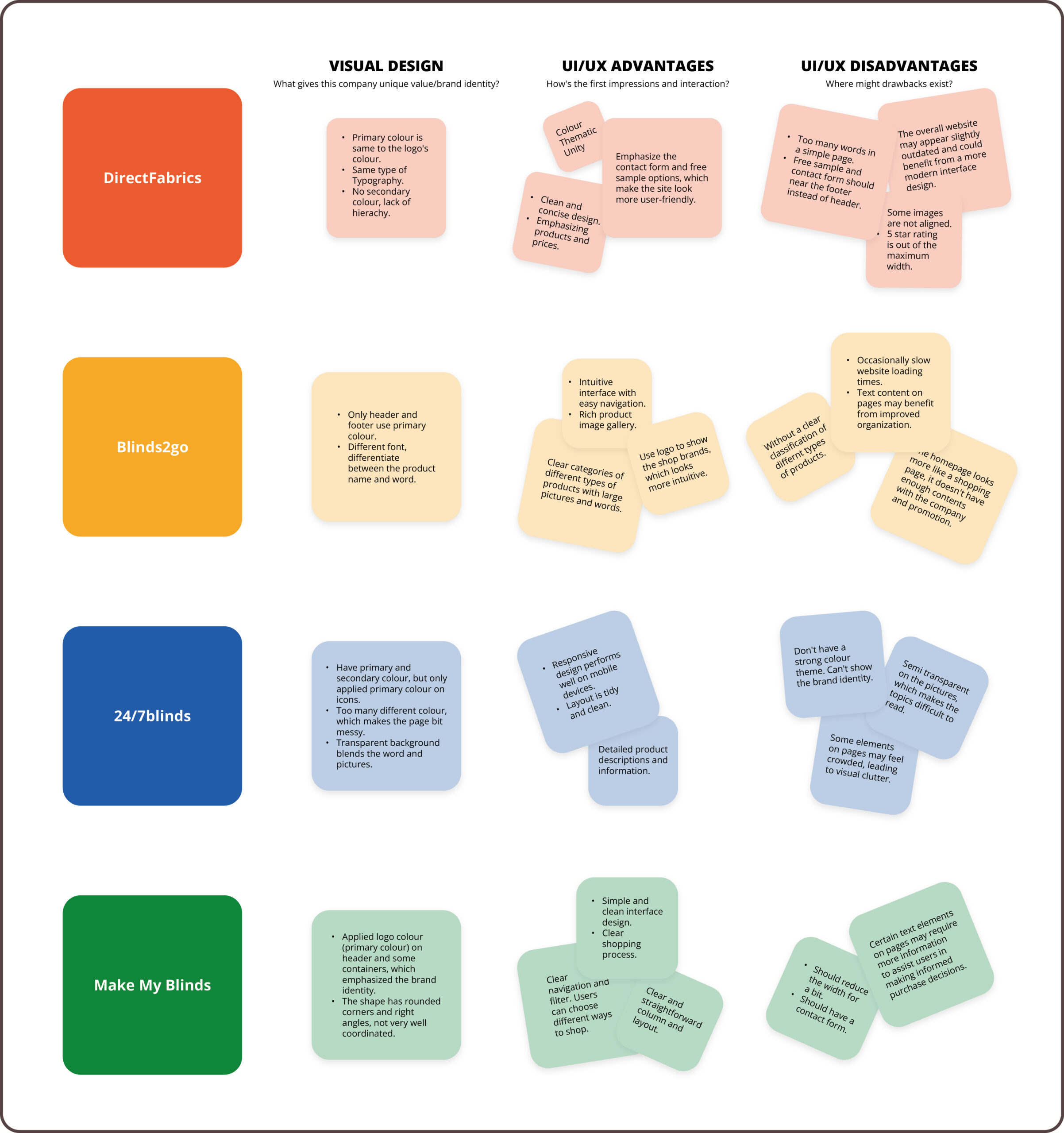
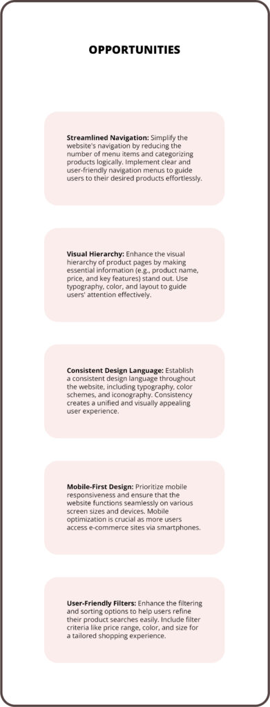
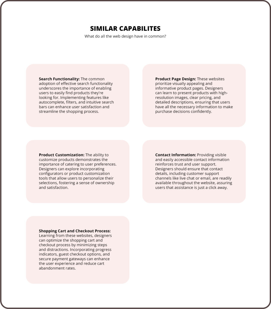
Through analysis, the navigation bar and filters needed to become more user friendly, and the overall site design needed to be more visually unified, with attention paid to the hierarchy between the various thematic modules,
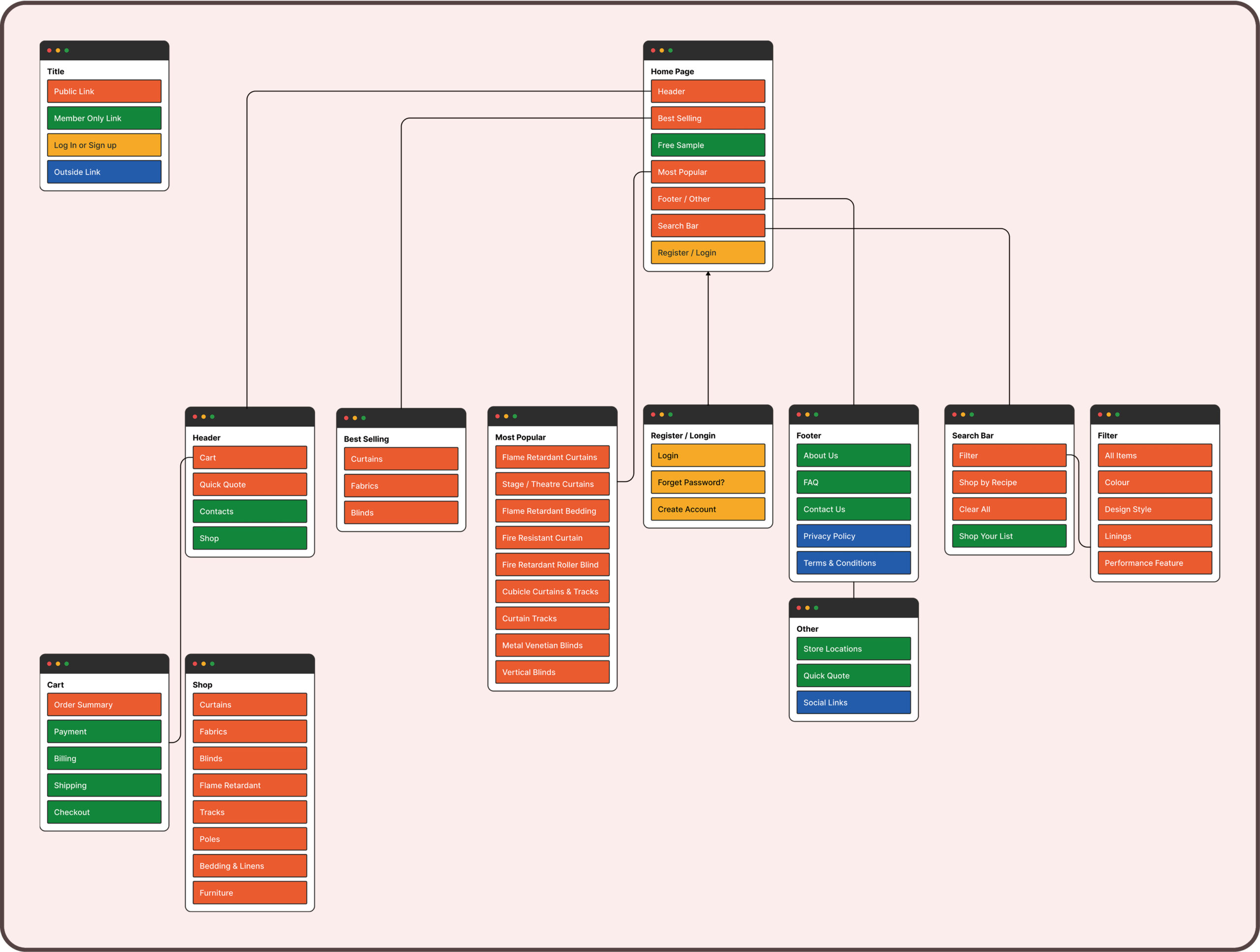
VISUAL SITEMAP
After analyzing the site, I reorganized the overall structure of the site and reimagined the homepage. The interface was made cleaner and more prioritized without reducing the content.
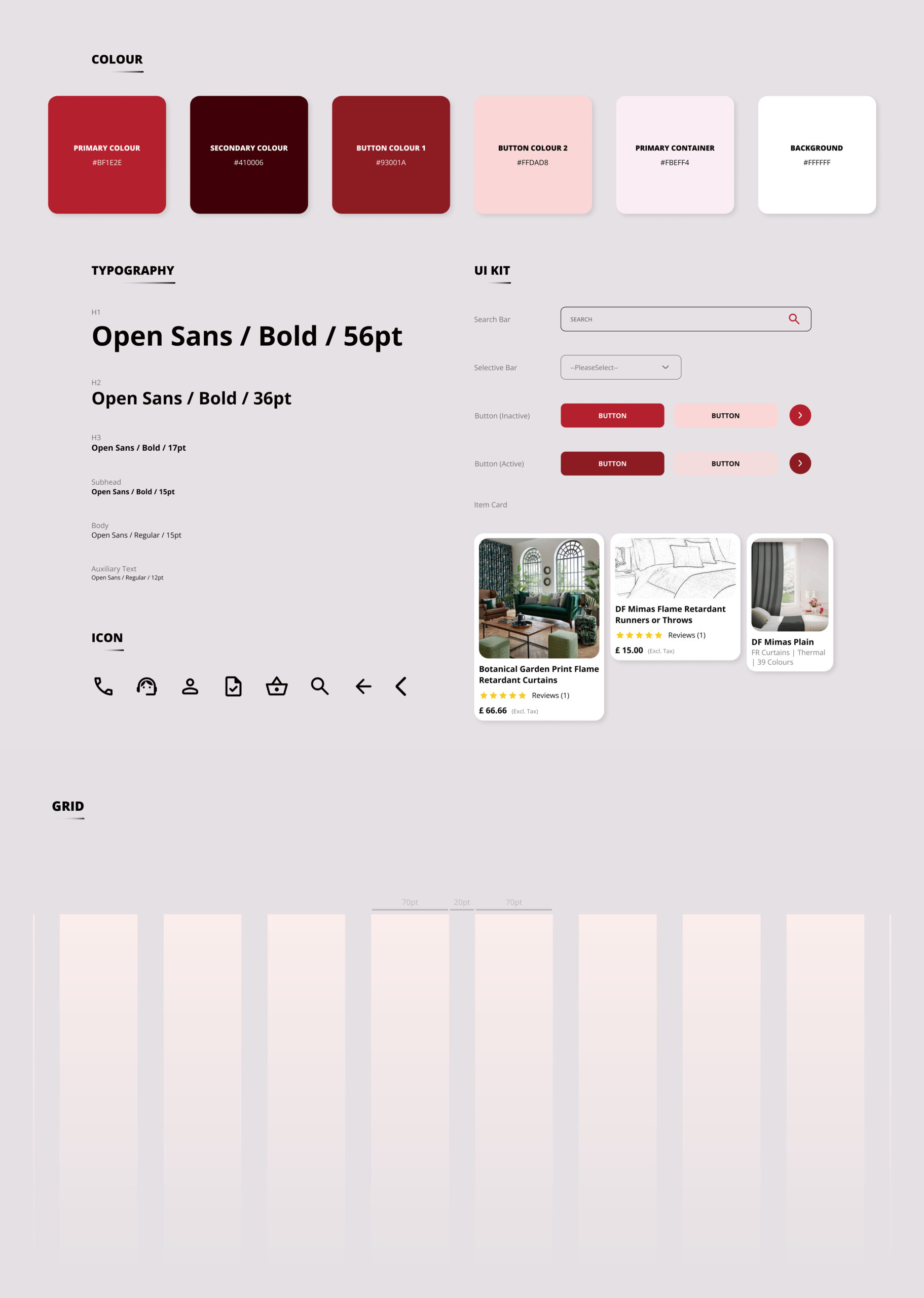
UI KIT
Various card quantities were considered 3 and 4. Therefore, 12-column grid was used, margin and gutter are 190pt and 20pt respectively.
Prototype
The prototype allows me to better understand the overall structure of the page and the general flow of the user. After creating and testing the page, I realized that the line spacing on the page was too small, causing the overall content to be a bit crowded. And the first image on the home page did not serve as a good visual focal point.
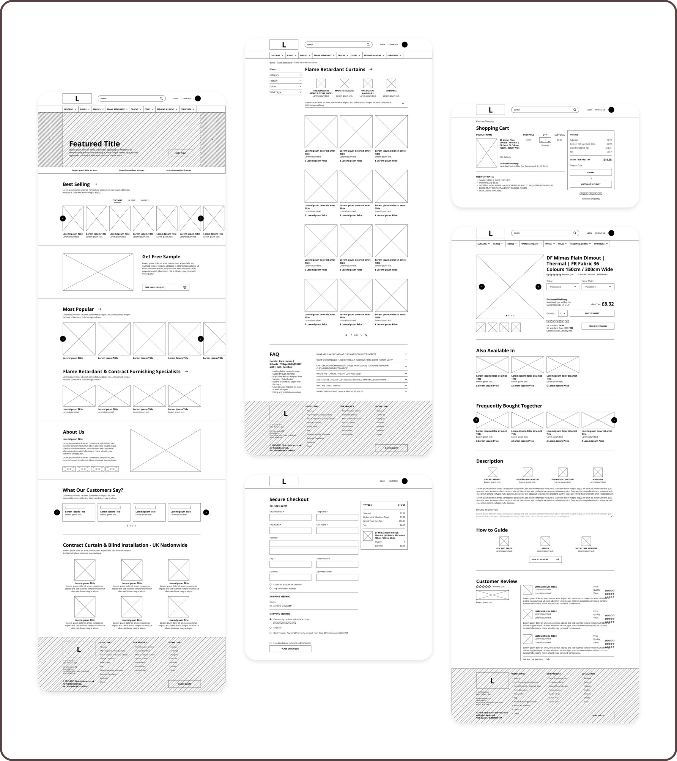
Home Page
Include the main image on the homepage for added visual appeal. Reduced the content of the homepage and replaced it with an image, and added the best selling section.


PRODUCT PAGE
Redesigned filter, simplified the content presentation form of the product profile, and made the whole page more refreshing and concise.


PRODUCT DETAIL PAGE
Redesigned the product description section and enlarged the review section so that users can evaluate the product more intuitively. Redesigned the interface so that more related products can be displayed.


NEW NAVIGATION BAR
The new navigation bar design allows users to visualize different kinds of products more intuitively. Mobile has also been re-adapted.
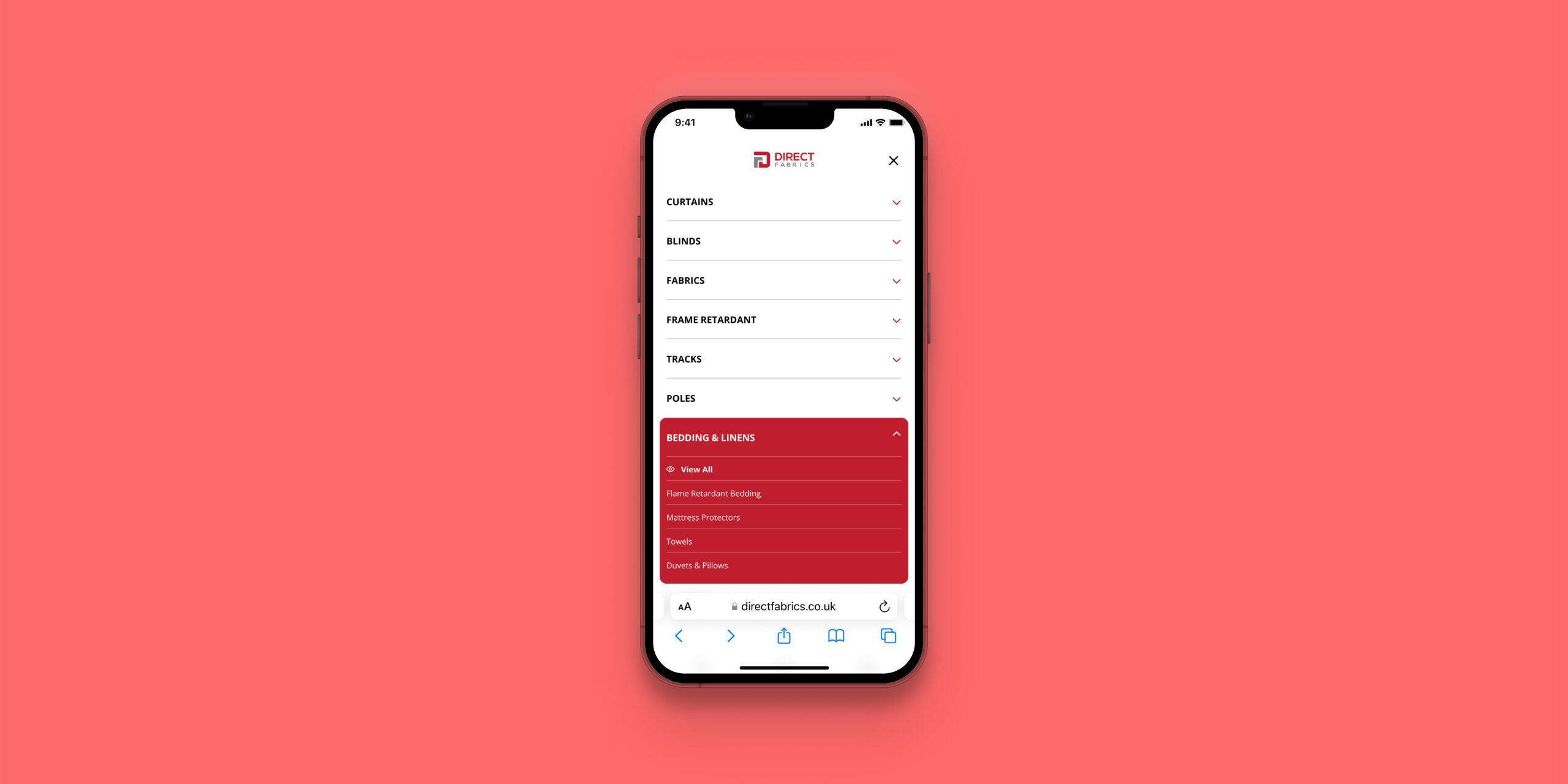
Pic. Navigation on Phone
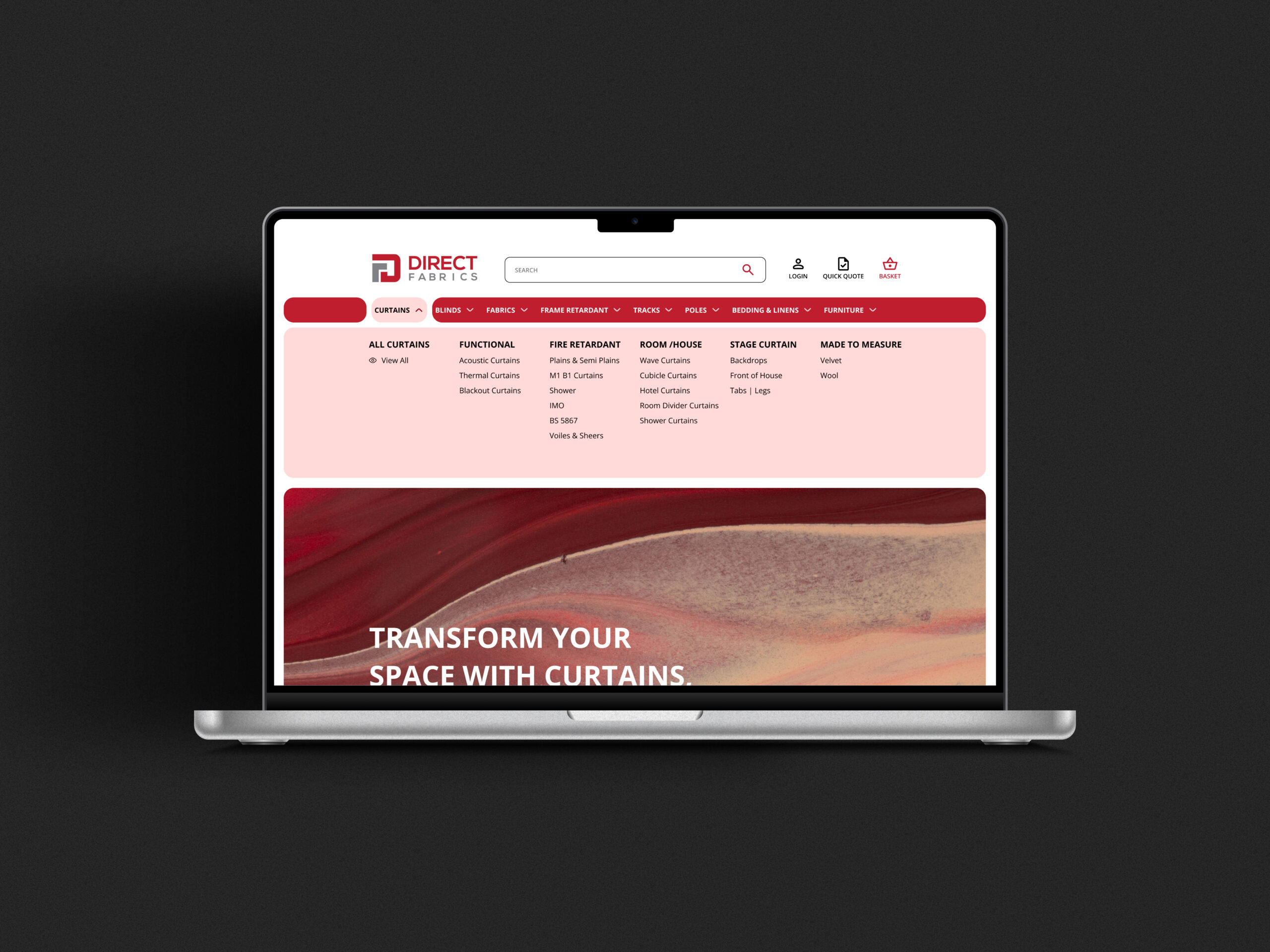
Pic. New Navigation Bar on Web
EASY & PLEASANT SHOPPING EXPERIENCE
It simplifies the overall shopping process, but will also give customers a clear view of the products they are purchasing, giving users a pleasant shopping experience.
