1MILLION FAMILIES MARCH
UX/Web Project /
Ian Jia / Roy Yang / Ivy Dong / Vidhi Sanghvi, Nov. 2023 - May. 2024
About Project
The 1Million Families March, organized by The Ahmad Butler Foundation, aims to raise awareness and spark public discussion about childhood cancer, advocate for increased government funding, and fundraise to create seed funding. We designed a promotional website for this charitable initiative to increase public engagement, encourage participation, and attract corporate sponsorships to support the cause.
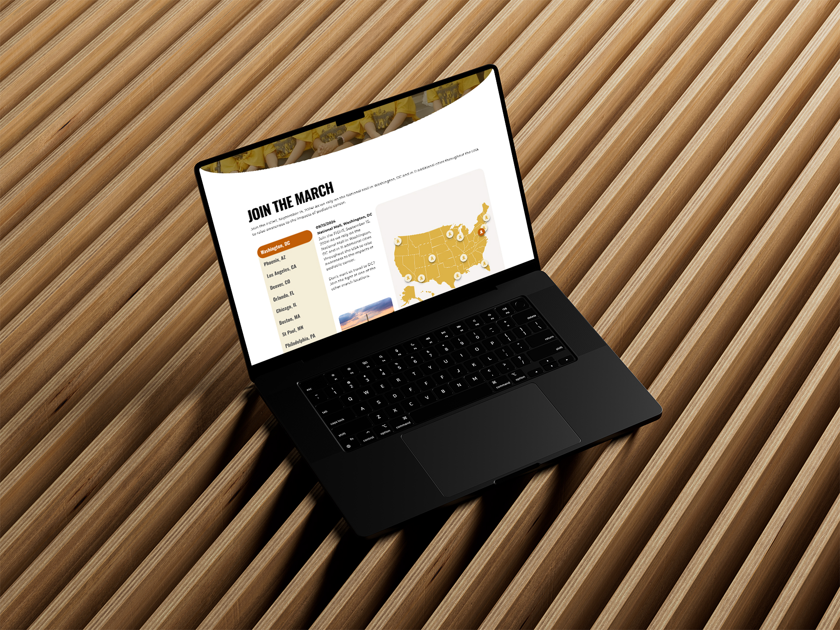
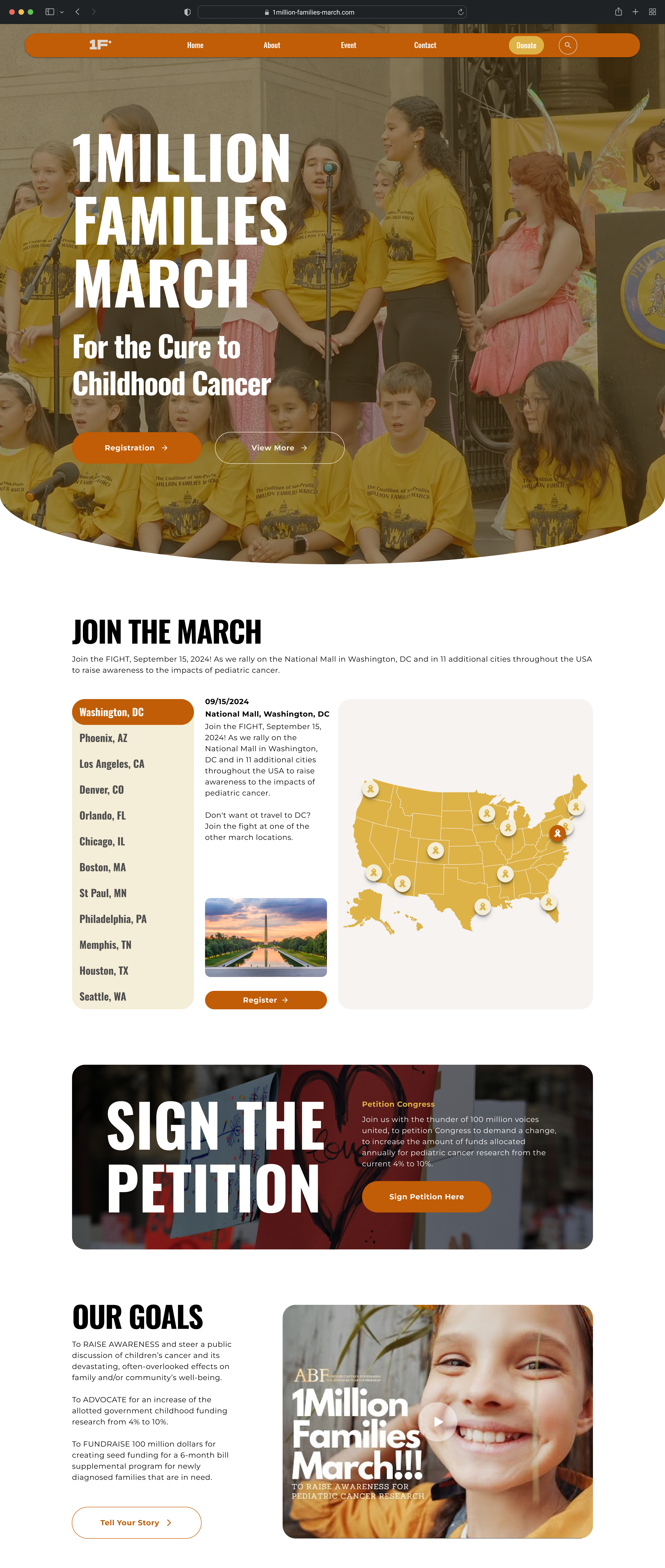
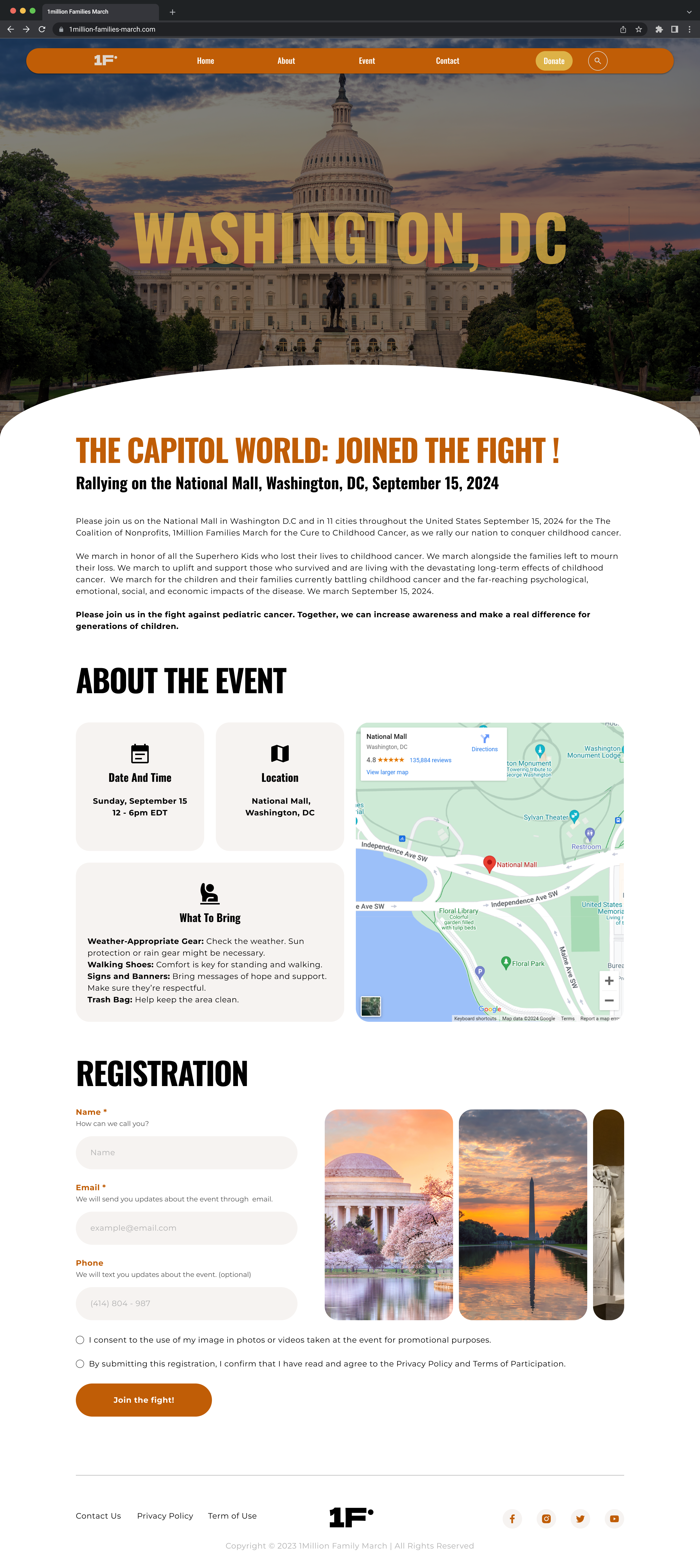
The names of the satellite march cities with a free registration button for each city. A map of the USA starring the cities (visual).
- Which cities are we focussing?
- Are we creating a separate page for that? or on home page?
- What all details needs to be mentioned? (Address , maps, timings and other details)
This is a Health Fair, the page should include a registration button, a button (or information) for exhibitors wishing to rent space in the showroom, and a corporate sponsorship opportunity button for companies wishing to sponsor. Should be room for the 4 day agenda, displaying special speakers, exhibitors, and a motivational speaker spotlight.
- Are we showing plan and asking the exhibitors to reserve their spot?
- List of exhibitors for companies to view and contribute options?
- List of companies who have already contributed to the Exhibitors for others to view?
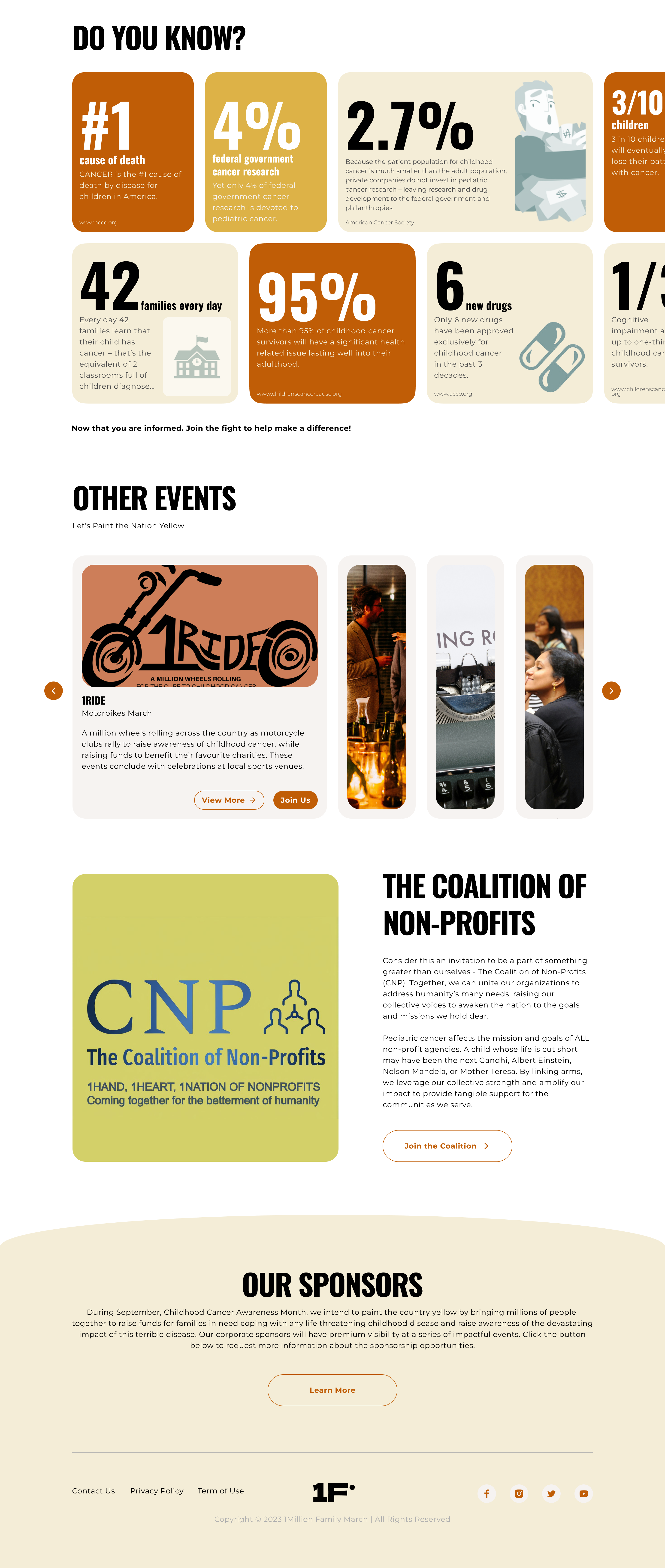
Describing the benefits of participating in this movement. With a “Join us” button for other nonprofits, sign up or receive more information.
- Are we creating a separate page for that? (Page for non profits to participate)
- Giving info and reflecting importance of the initiatives?
- Giving options for join us & signup for more info?
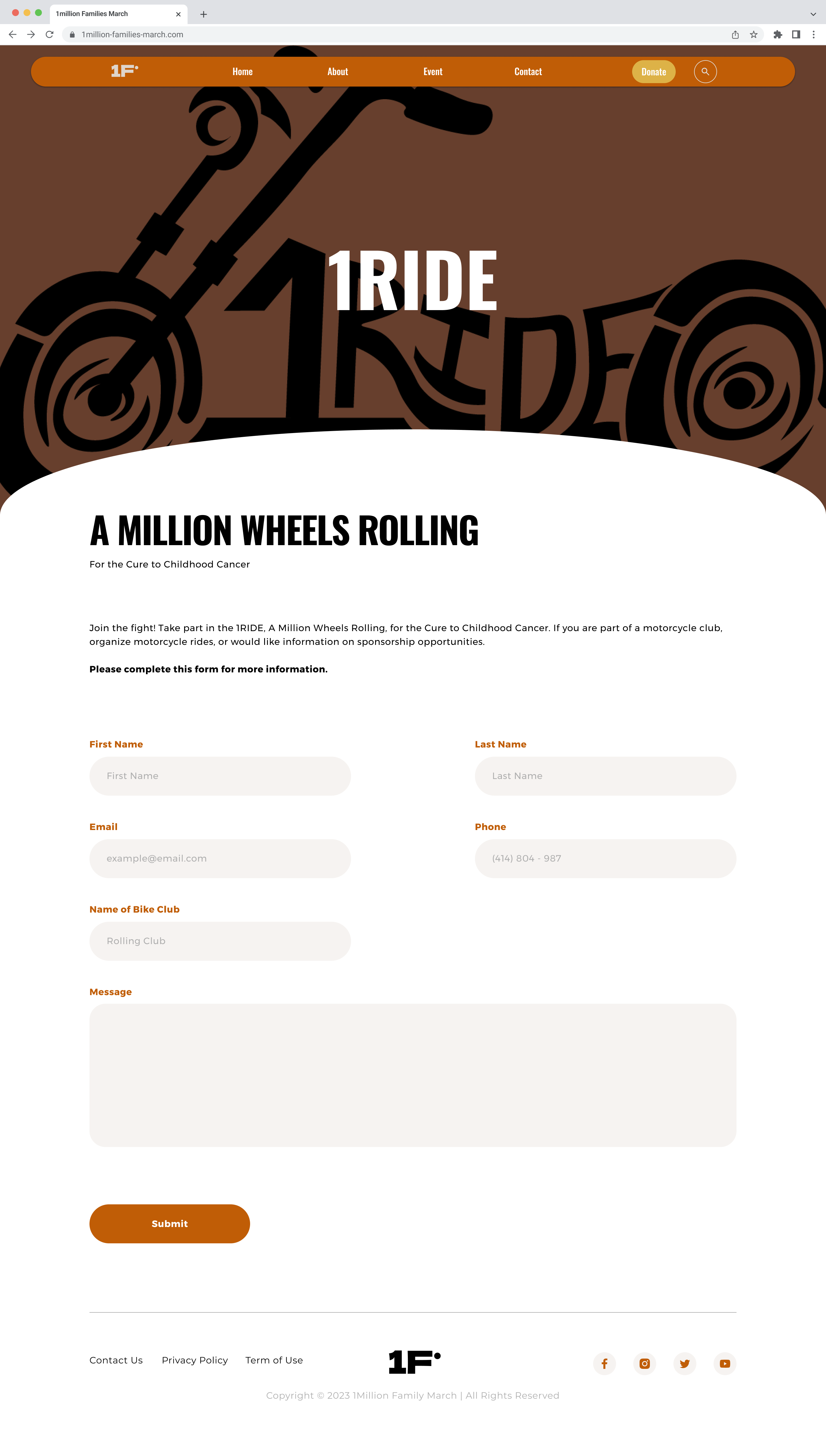
With buttons/links for motorcyclist registration, corporate/business sponsorship opportunities, and a way to monitor the charity fundraising competition.
- Are we creating a separate page for that? (Page for people to participate)
- When will be the competition held? (location and other details) More information about this initiatives ?
- Motorcyclist registration options? (how many distance race) Is there any registration fees?
- Business sponsorship options?
- How many are participating lists?
Should have a button allowing people the ability to request an interview or tell your story to give an impact statement of how Childhood Cancer impacted their lives. And space to show teasers of the documentary.
- Videos page for people to upload videos and impact story?
- Will be on request? Sending mails or registering and then after getting the permission they can share?
- What else do you need to be shown on that page?
Because this will feature local talent in cities throughout the USA as well as celebrity talent. We want a feature to allow the community at large to request a chance to brandish their talents for charity, and/or join the movement button for celebrities/agents. There should also be a way for people to volunteer.
- Do you want a options for people to volunteer or show their talents?
- Do we want people to register and show in which category they want to show their talent?
- Maybe we can keep this in events sections giving list of events happening?
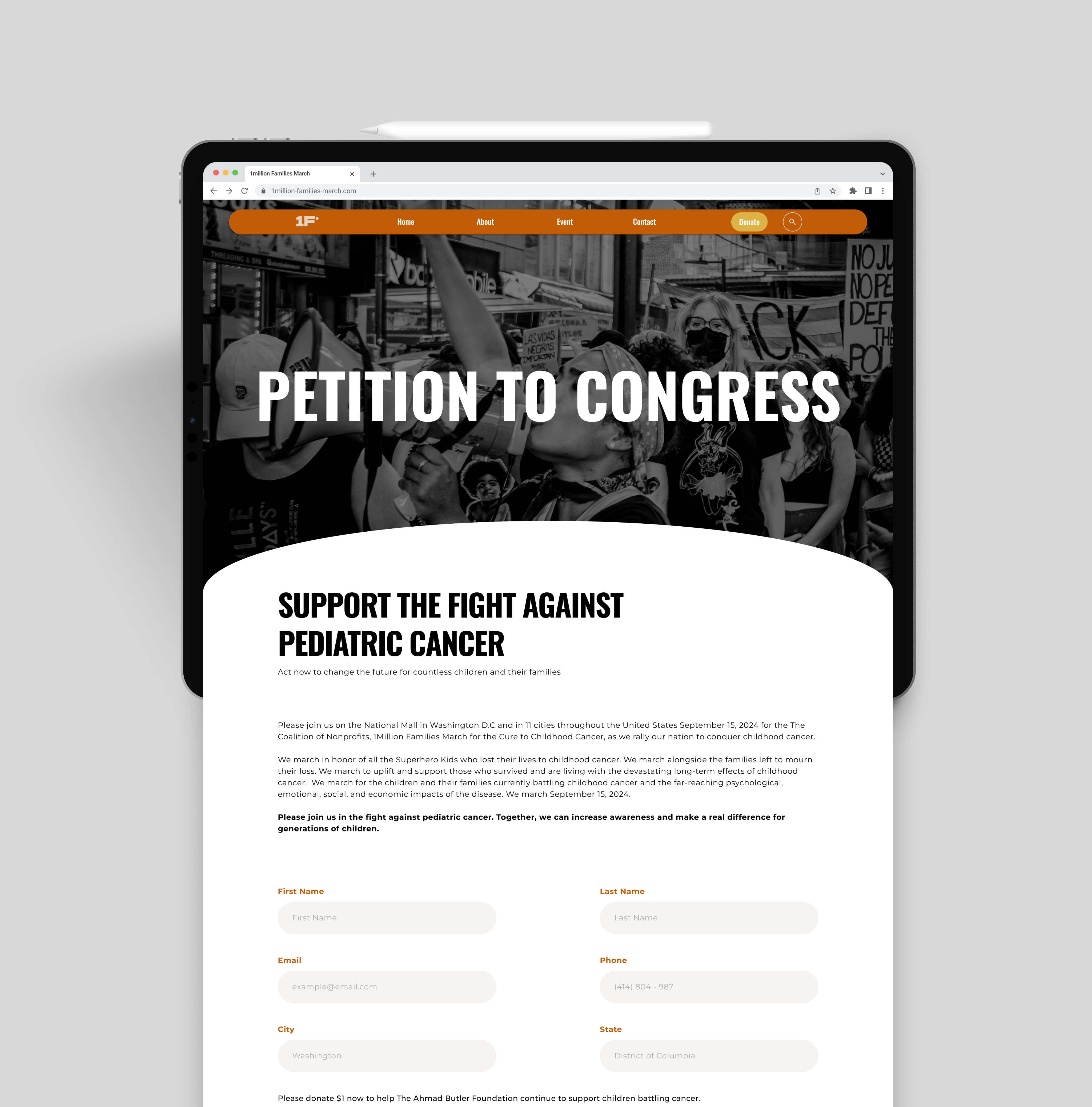
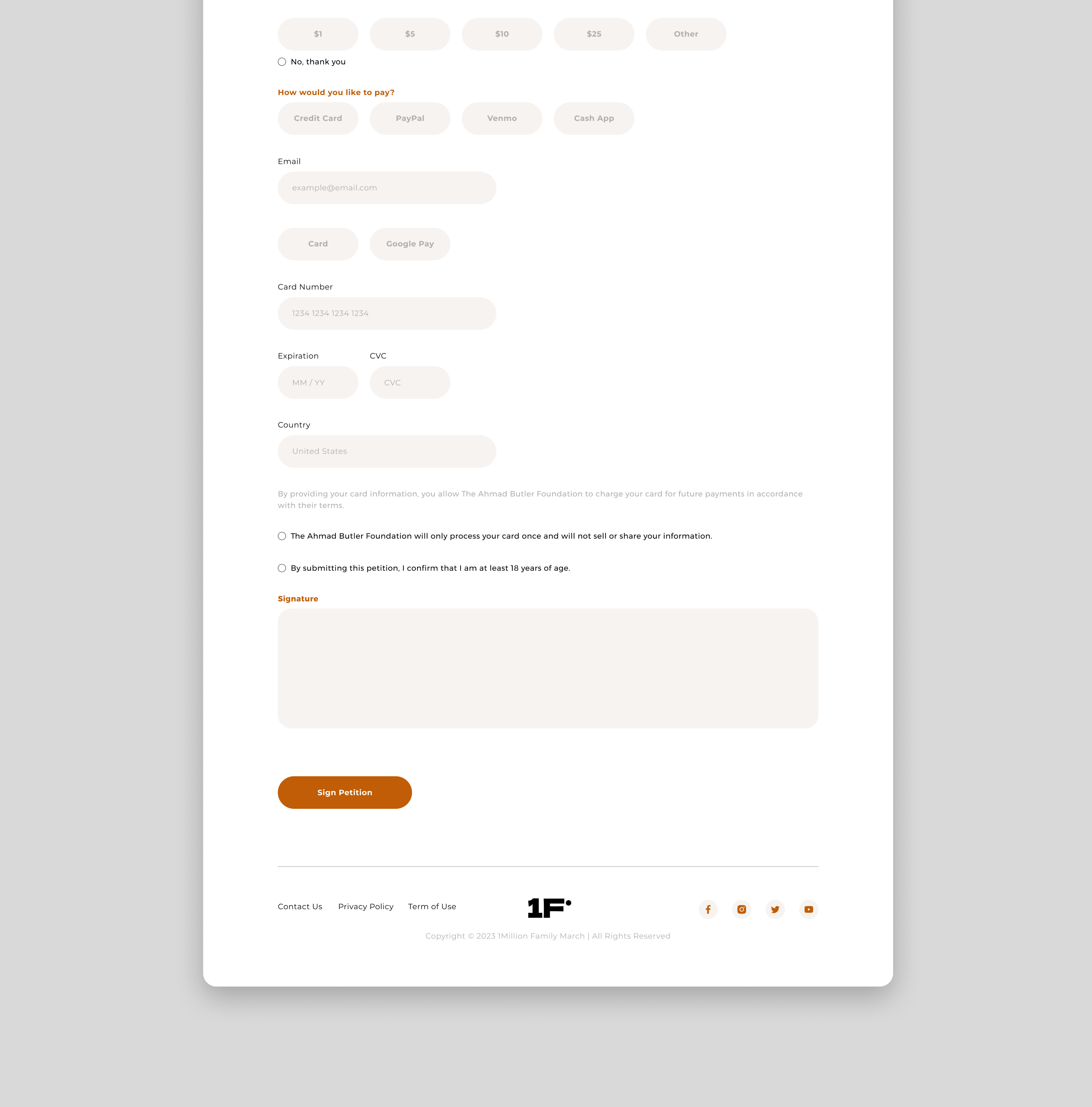
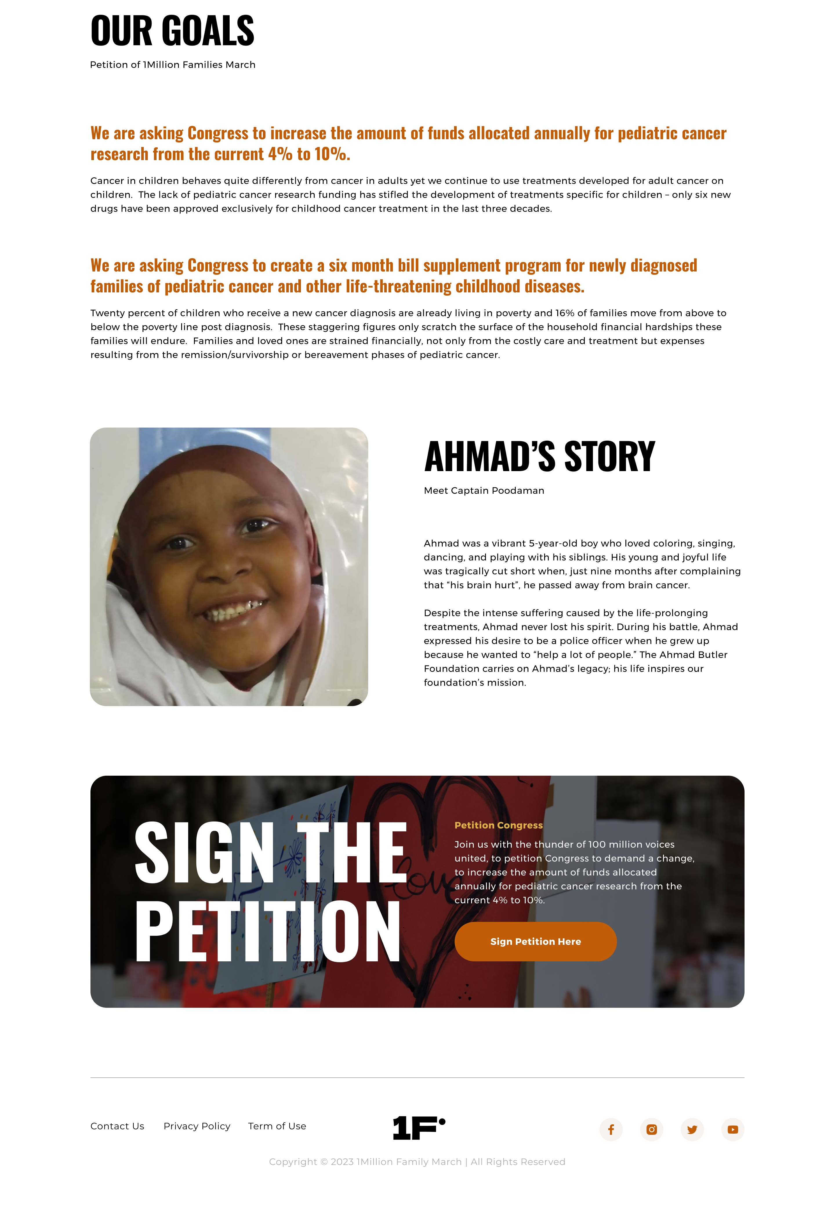
We would also like a page explaining the reason for the petition and a call to action button for visitors to sign our petition. Also because there is a possibility that we will be giving links to this website to hundreds of different nonprofits to add to their website. The page should be designed in a way that it can handle a large volume of site visitors without breaking down.
- What kind of petition?
- Why will visitors sign in?
- How would you want the non-profits to add to their website?
RESEARCH
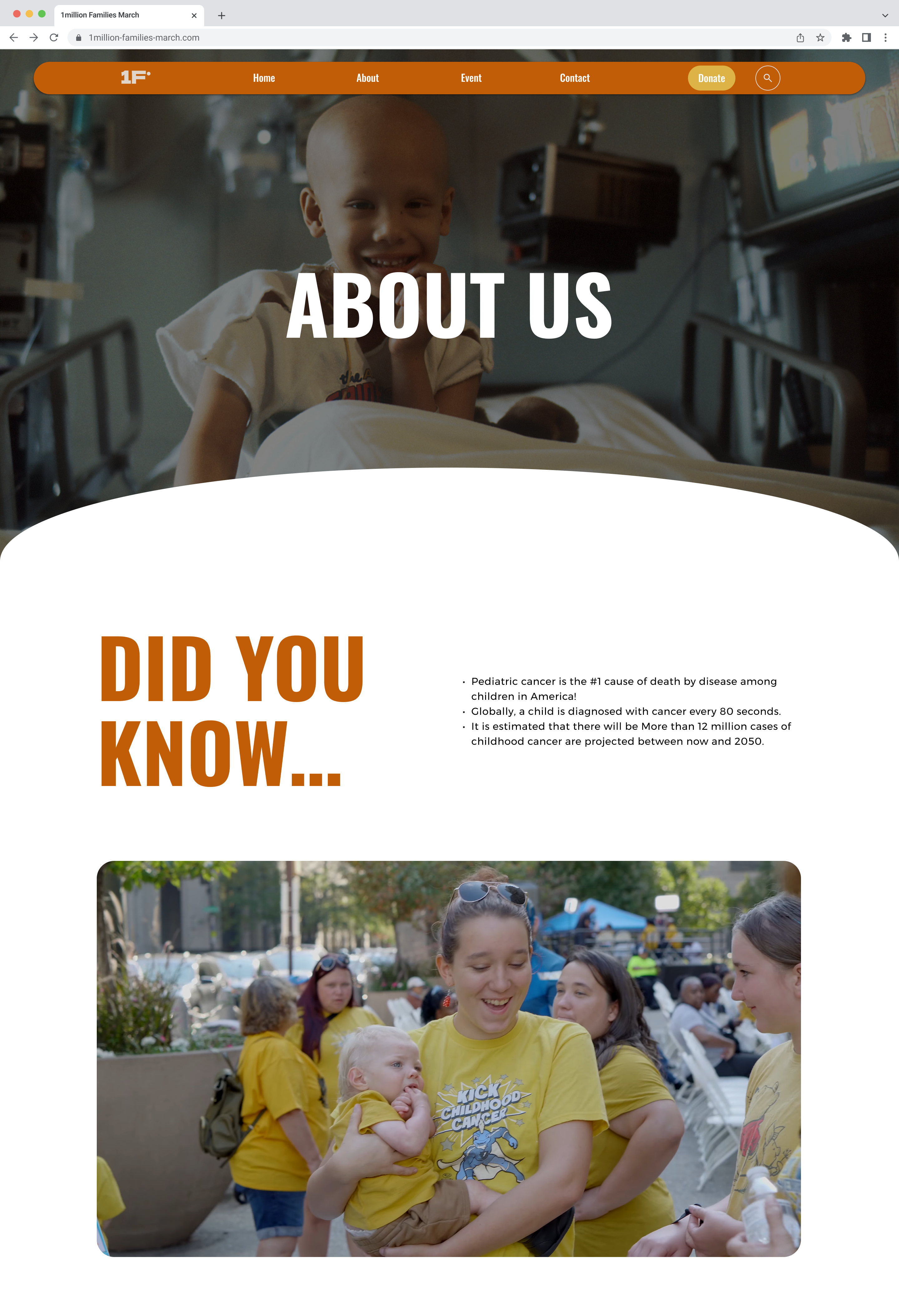
We conducted extensive research and analysis of various website design styles to better understand the preferences and characteristics valued by our client. This process involved studying different design trends, visual aesthetics, and user interface patterns. Additionally, we delved into the specific design elements of successful charity websites, examining their page structure, user experience, and navigation flow. By analyzing how these websites engage users and drive participation, we identified best practices that informed our design decisions, ensuring an intuitive and visually appealing experience tailored to the needs of the 1Million Families March initiative.
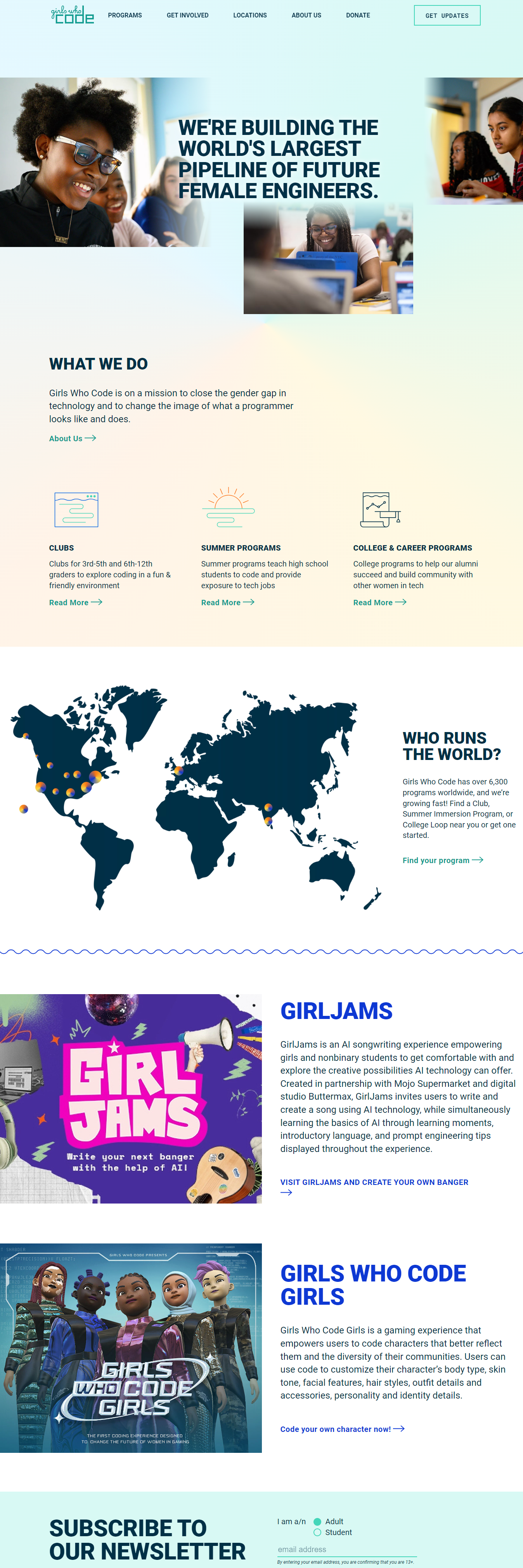
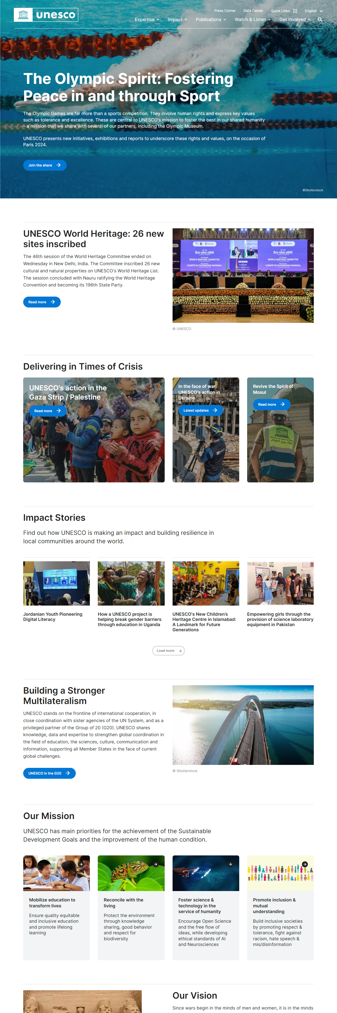
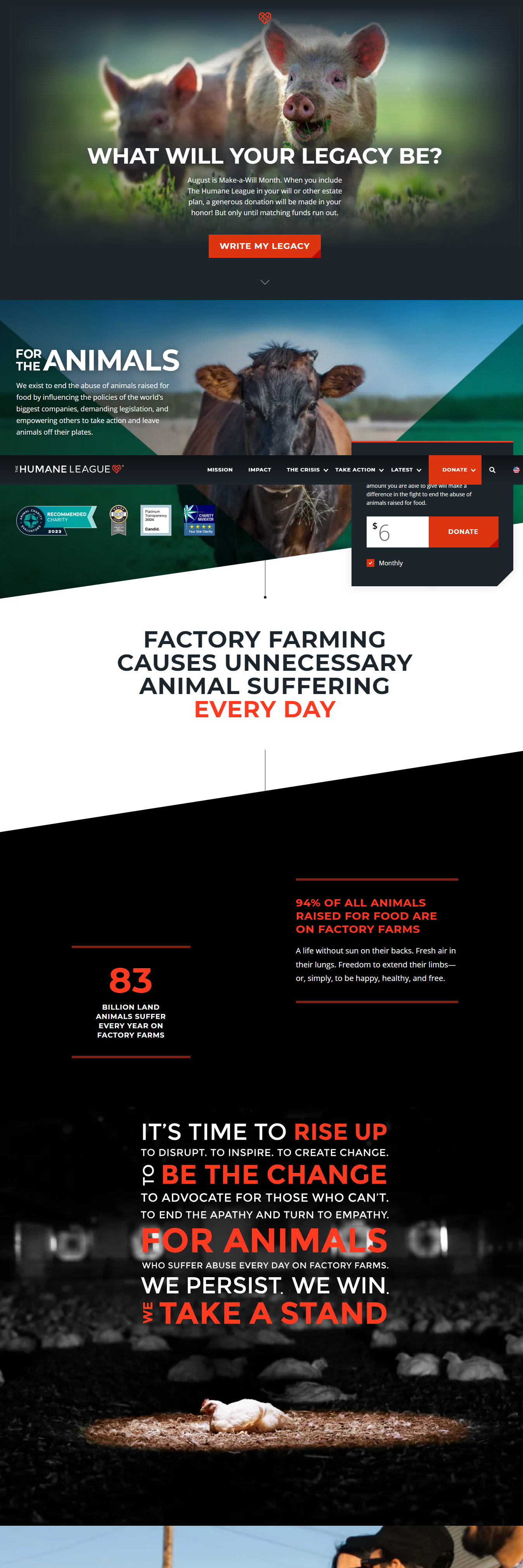
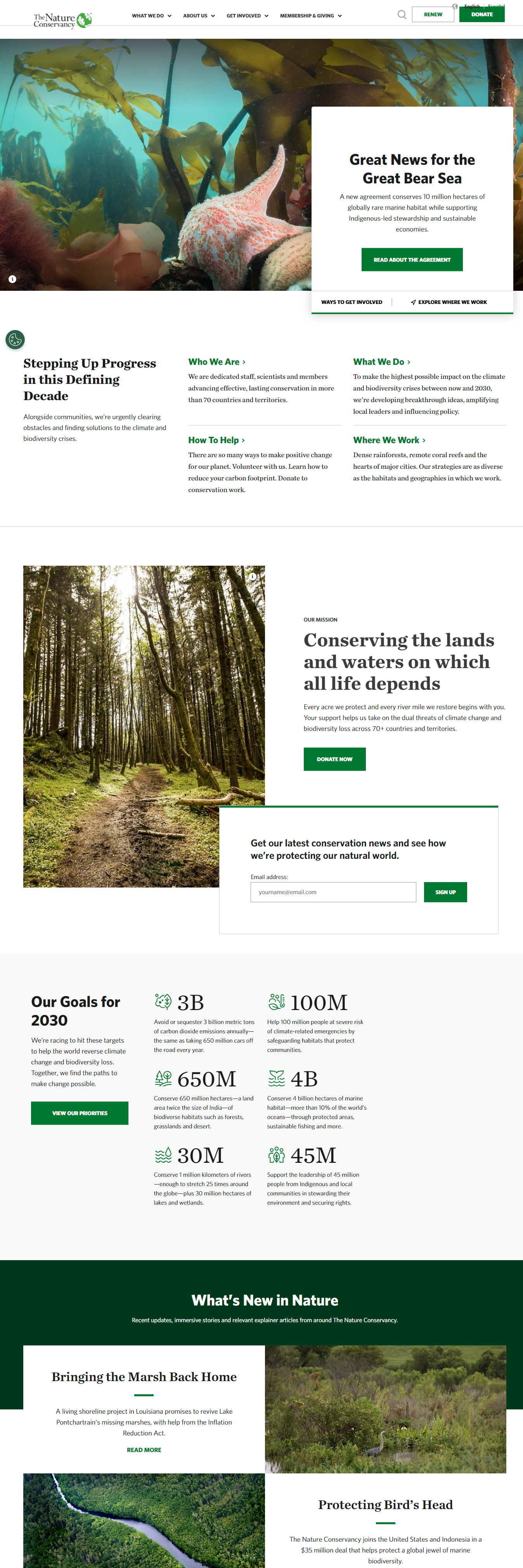
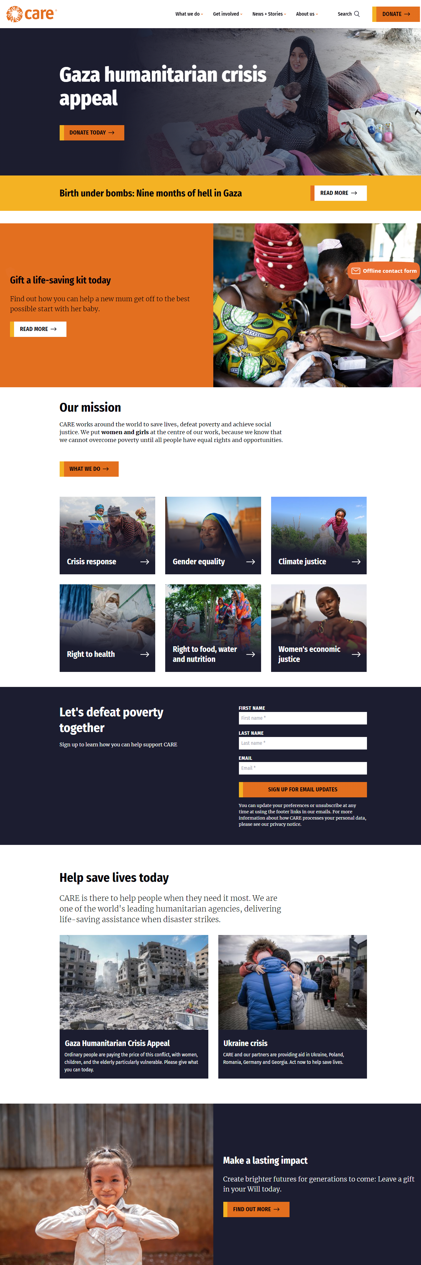
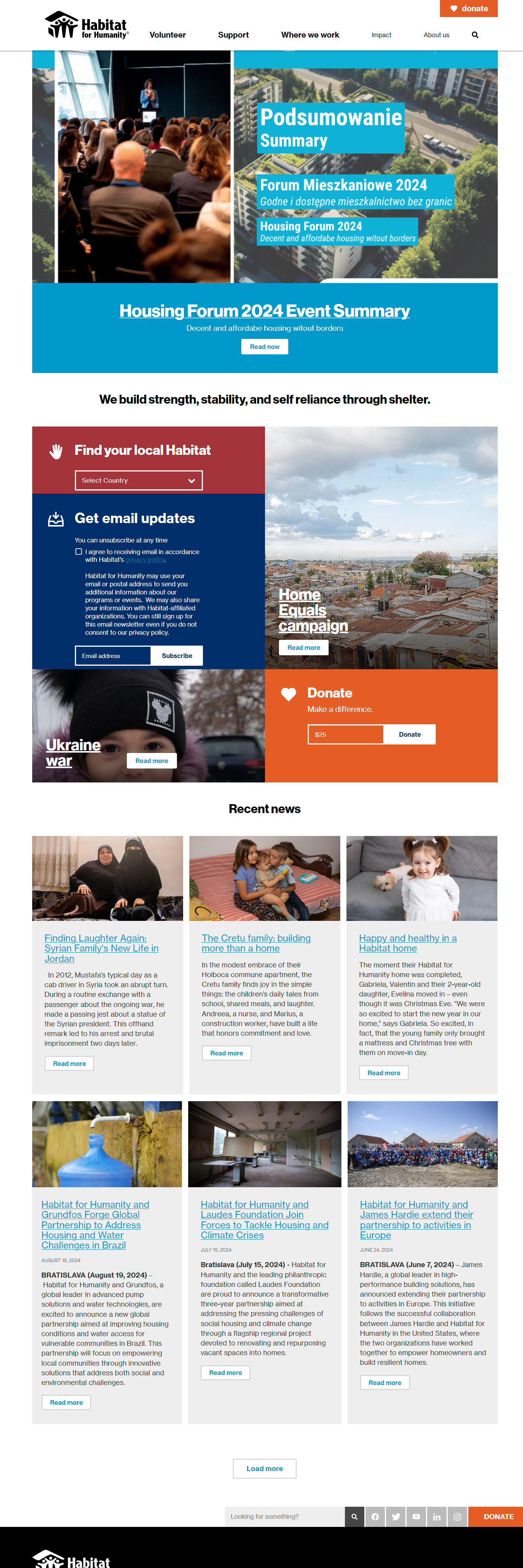
Event Inspiration Websites Research
- Outreach Unleash: 4 ellipses crossing with each other could be used to show the events.
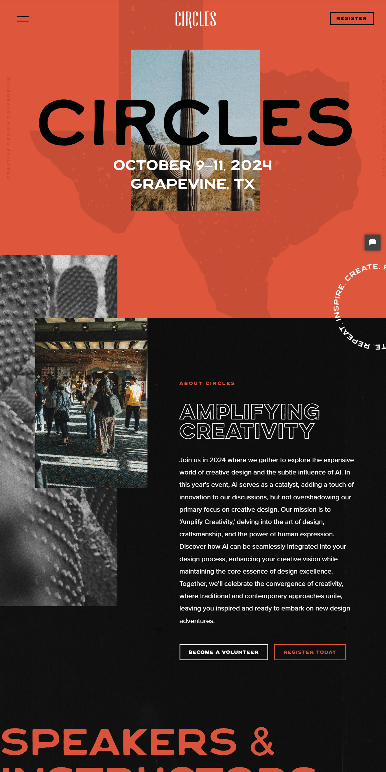
- Circles Conference: “This could be you” should be added to entice sponsors.
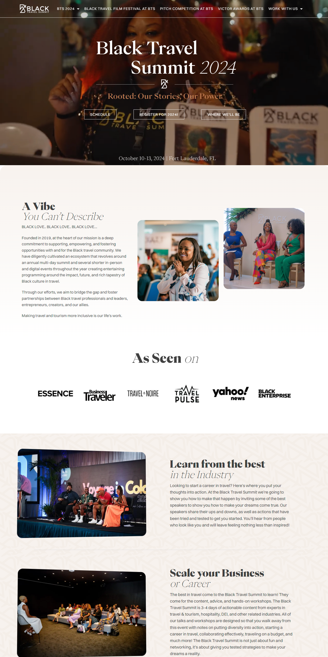
- Black Travel Summit: Need a countdown timer for specific events.
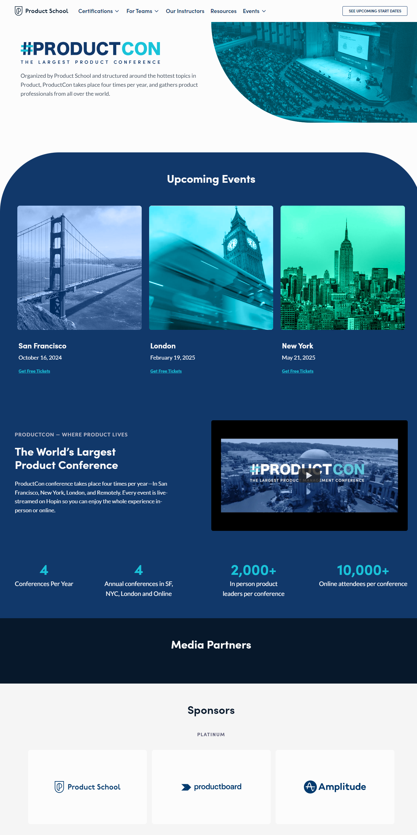
- ProductCon: Prefer the clean design rather than the ‘’party vibe’, Cards for cities hosting marches (interactive with pictures, maps), Show different levels of sponsorship. (platinum gets top billing, bronze would be a rotating marquee)
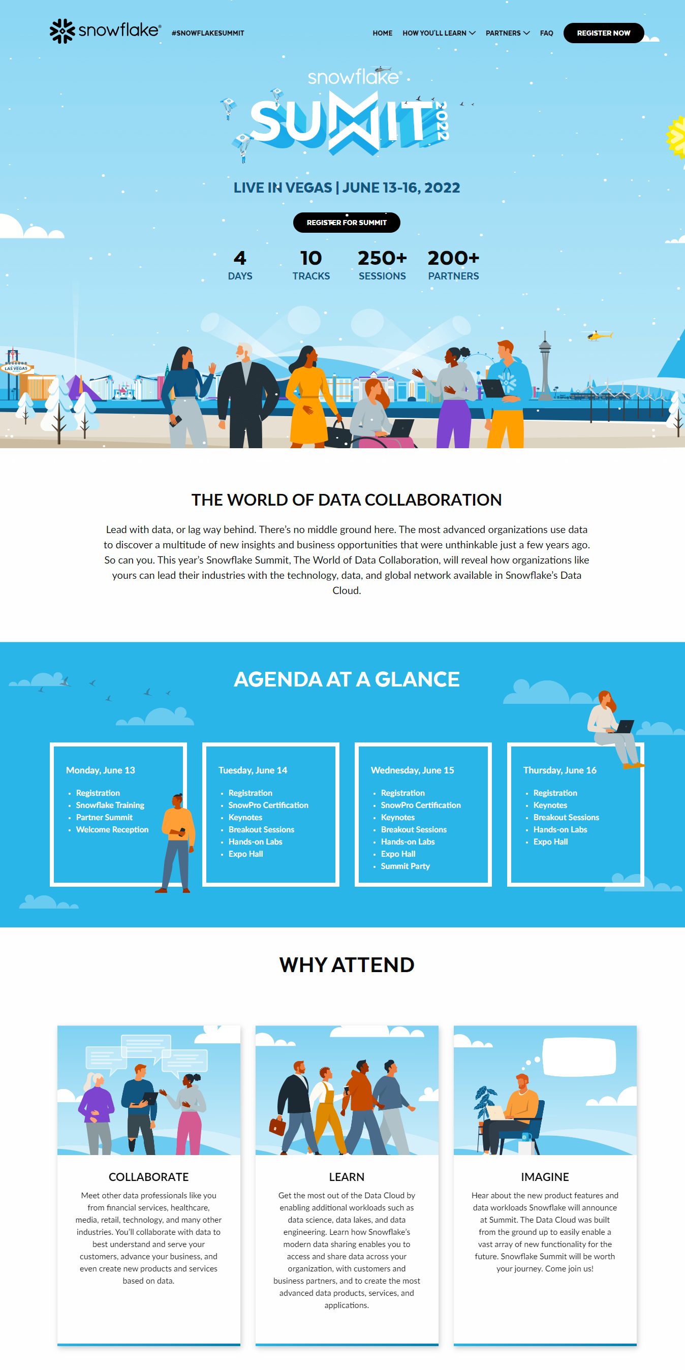
- Snowflake Summit: Use of illustration is smart when there’s a few high quality photos.
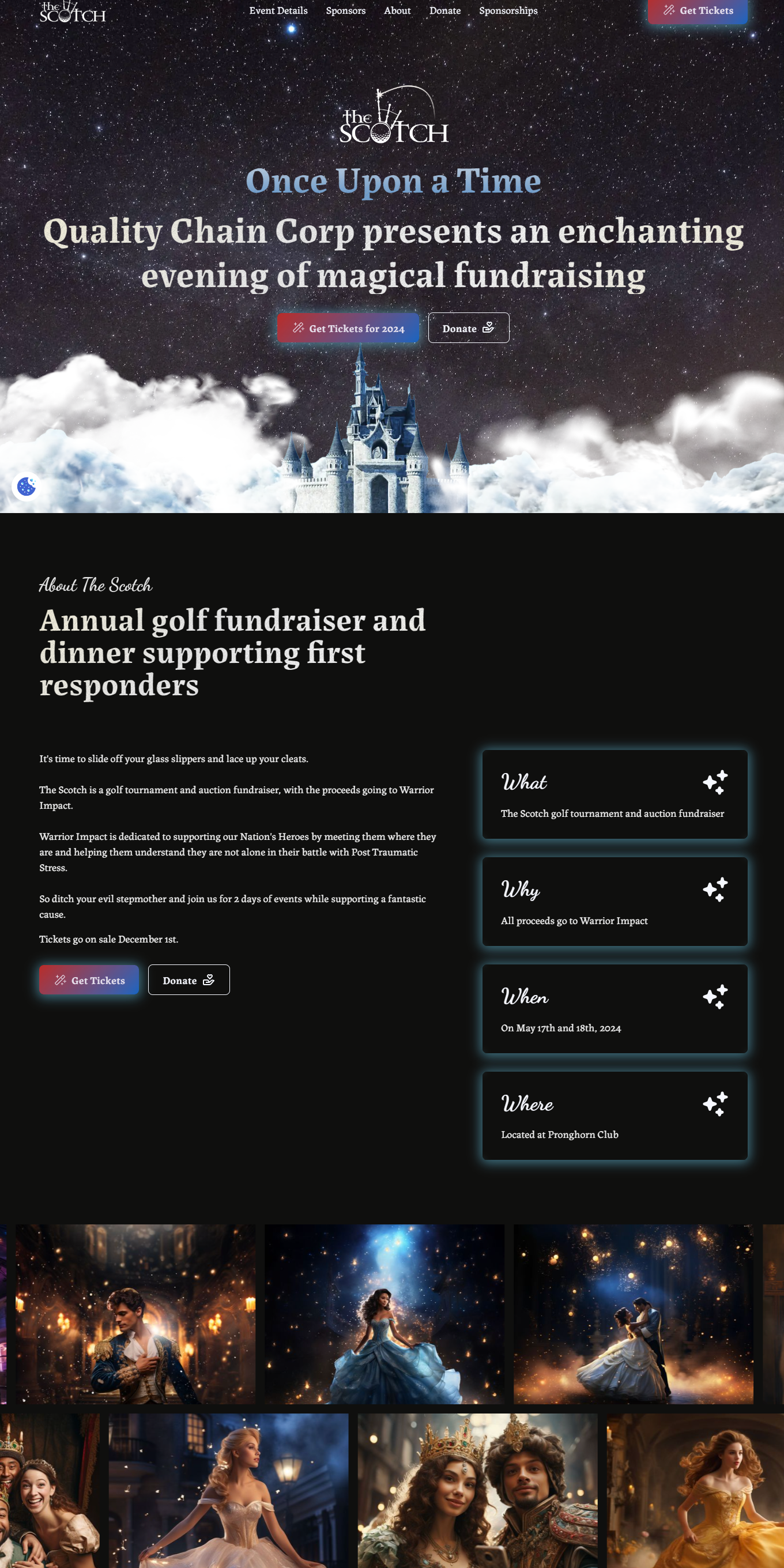
- The Scotch: Image carousel would be nice. (Although images are slim picking right now so may need to use free images or graphics instead)
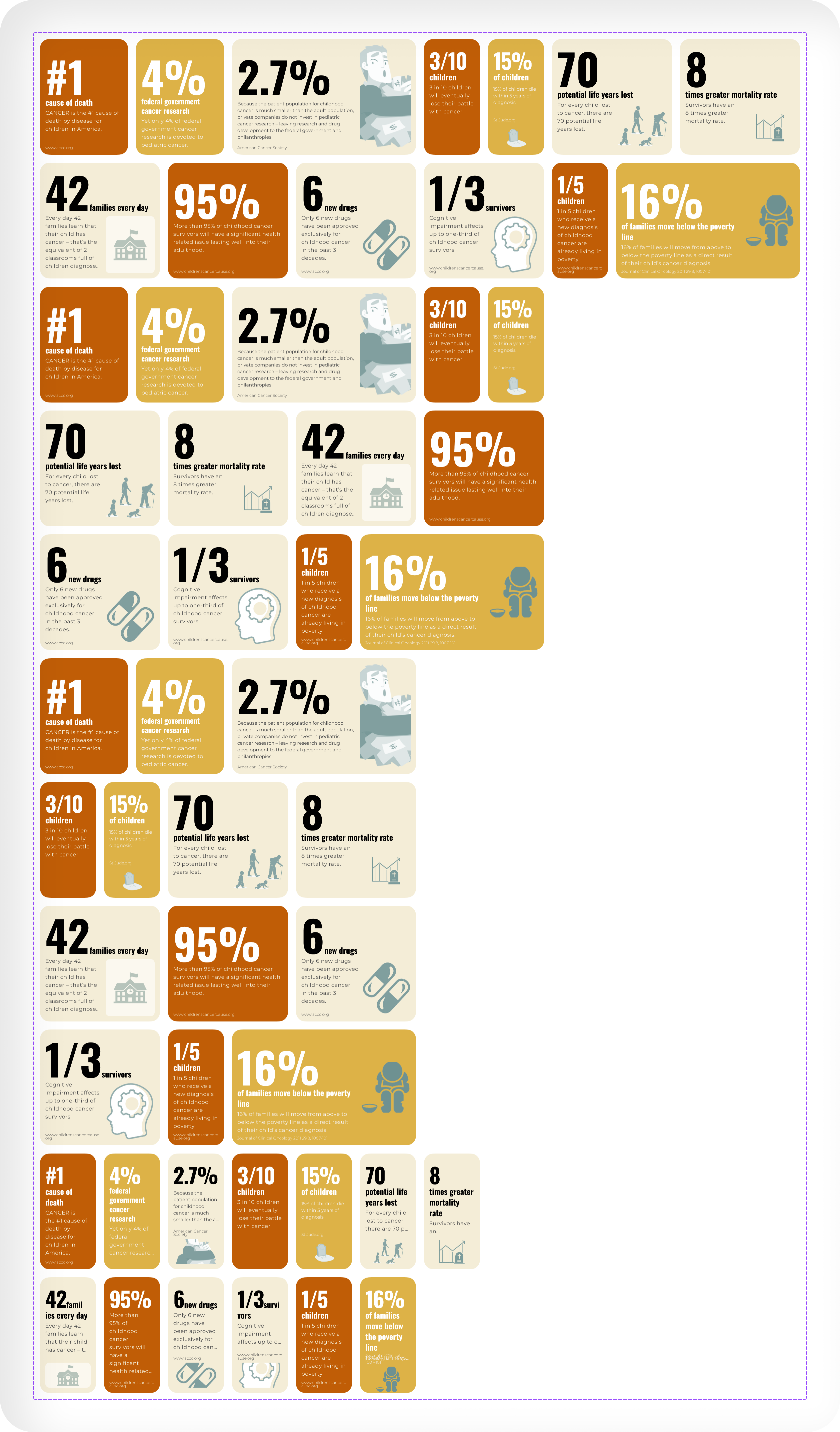
- DEMO Fest: Use moving, interactive numbers for statistics.
- Pop Brixton: Use oversized text to highlight key words or phrases in lieu of images.
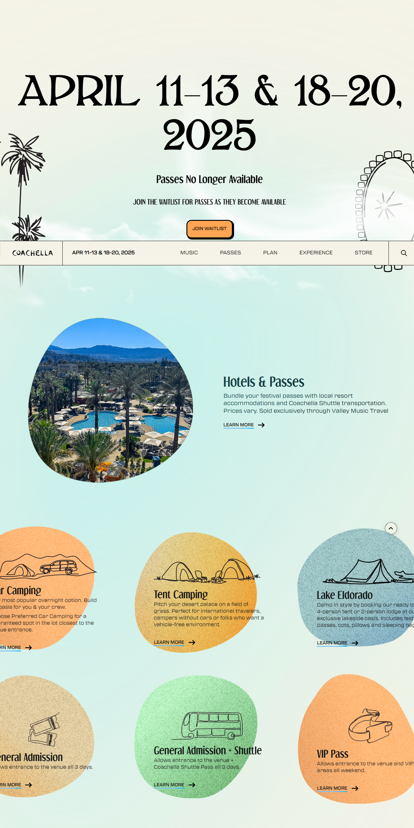
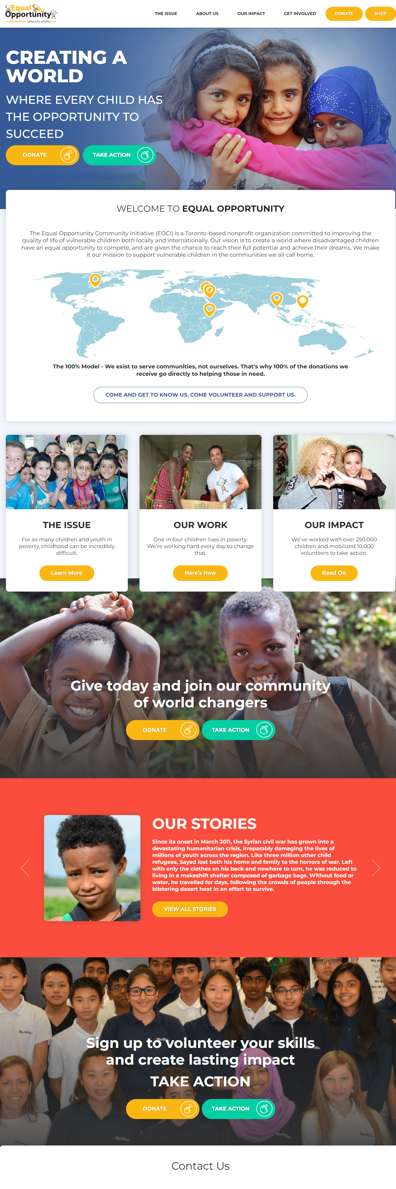
They really liked the usage of shapes and colors that could serve as cards to the other pages or projects. Everything will be included on the landing page with links or buttons should the user wish to read more. Additionally, MFM is open to font styles amd they really want a drone video for events.
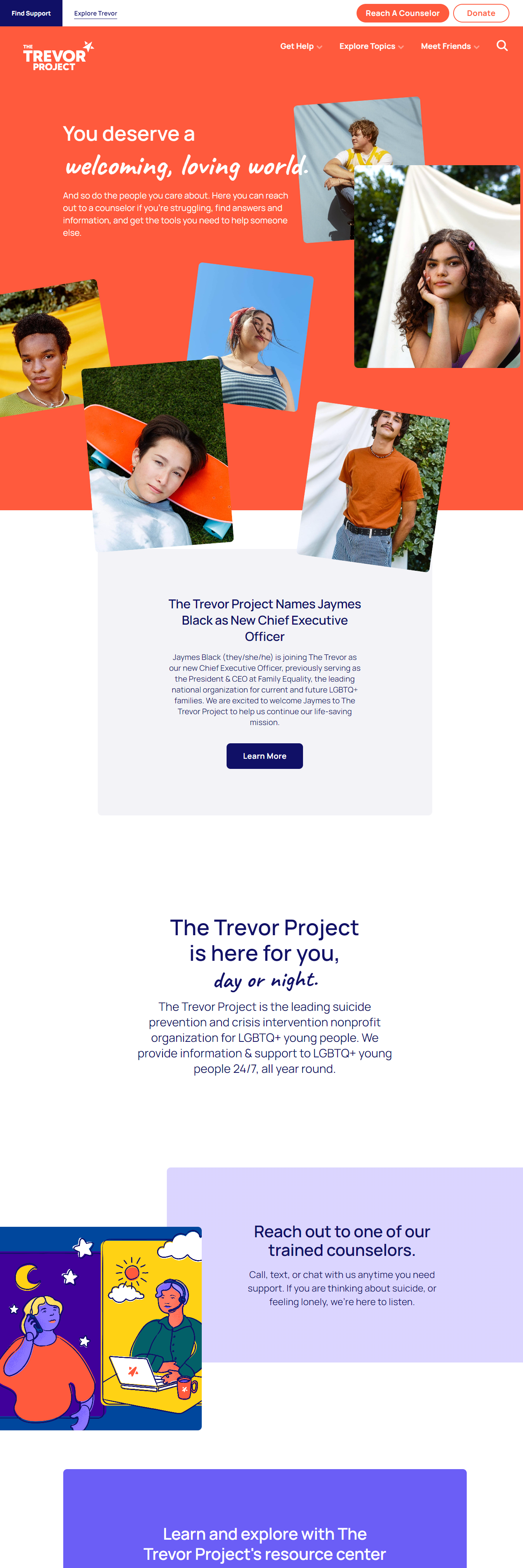
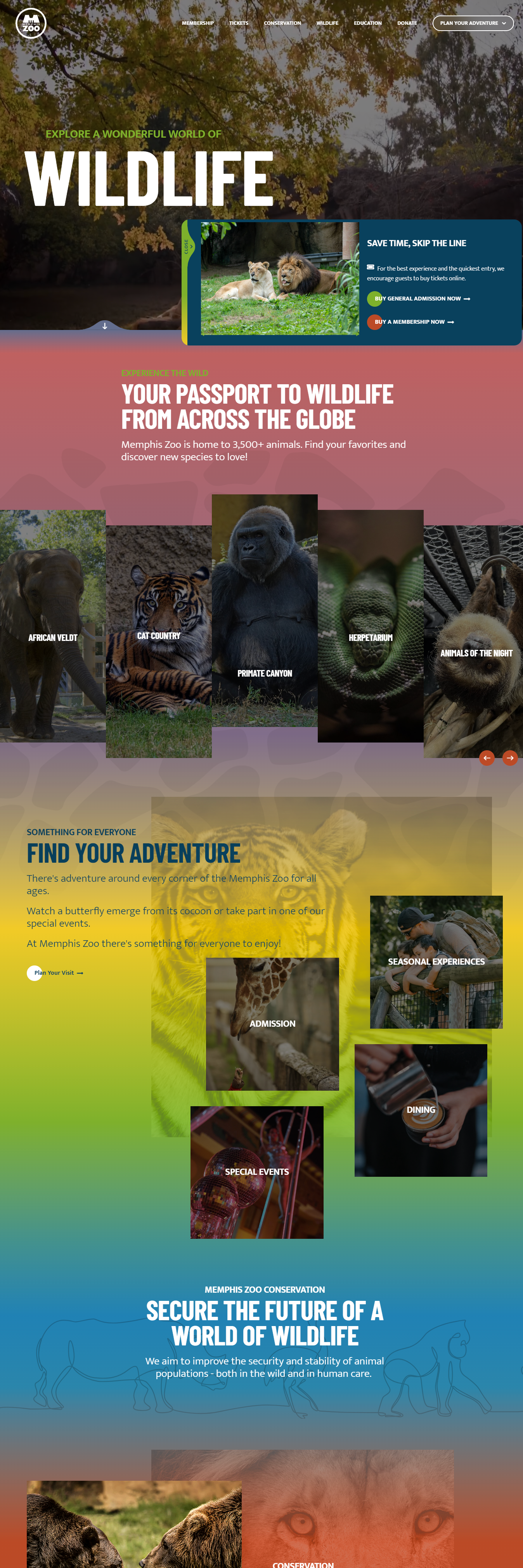
Nonprofit Website Research
After researching various charity websites, we identified and compiled common elements in their design styles and user flows. This analysis helped us understand the key features that contribute to an effective user experience and engagement across similar platforms.
Layout
Simple Grid-based
Dynamic Grids
Style
Minimalist / Flat, Bold and Vibrant
Illustrative and Corporate (Business-like)
Material: Use of subtle gradients, layering, and shadows to create a sense of depth, resembling physical materials
Glassmorphism: Emulates the look of frosted glass with blurred backgrounds behind semi-transparent panels, often combined with vivid colors
Interactivity
Static: Primarily focusing on text and images
Dynamic: With elements like hover effects, animated transitions, or interactive infographics
Scroll-based: Interactions
Elements animate or change as the user scrolls
Multimedia: Integration
Use of videos, audio clips, or interactive storytelling
Image/Text Visual Elements
Text on/beside Image
Full-width Imagery and Background Parallax
Rounded Elements
User Flow Chart
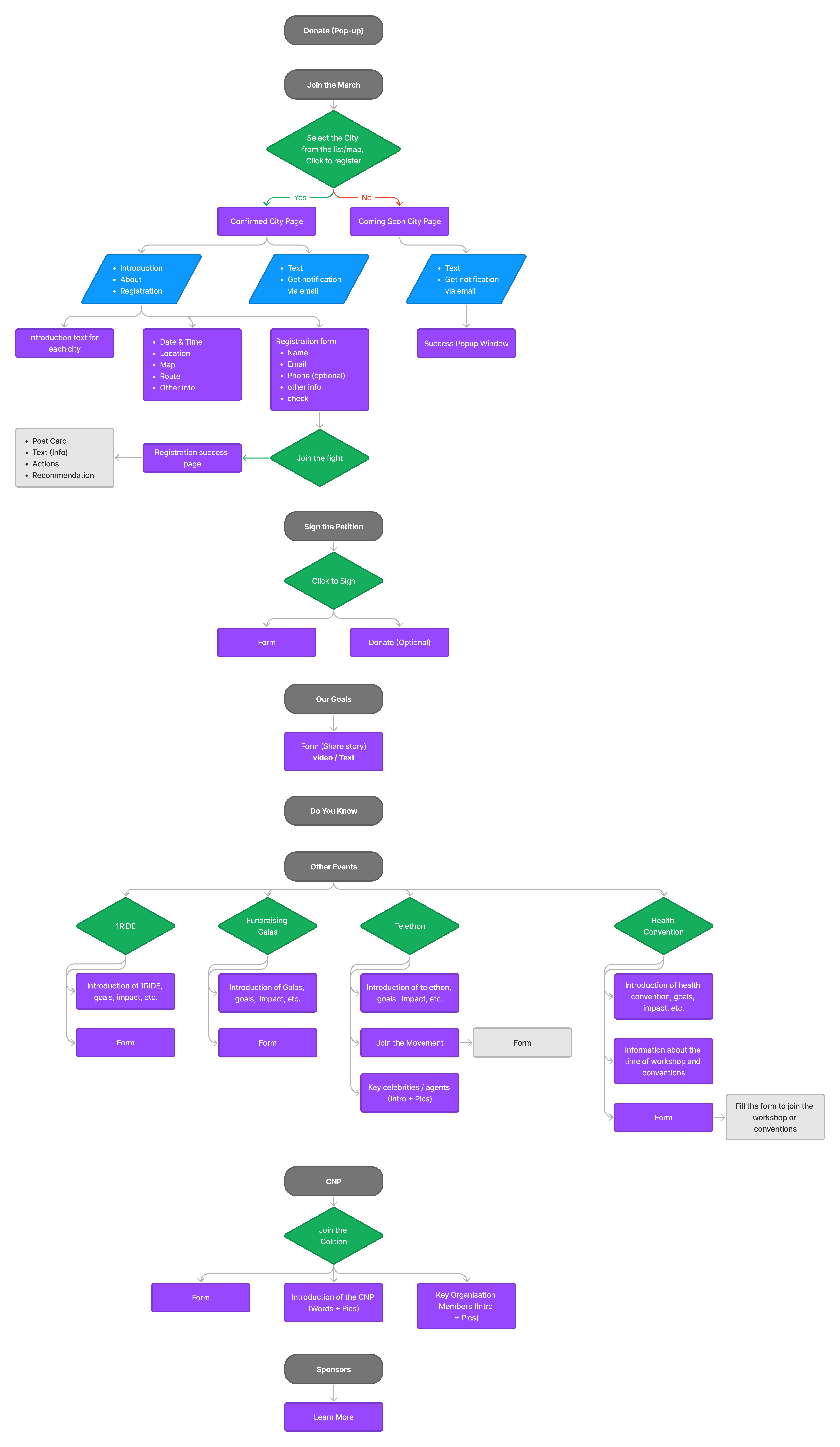
We carefully organized the content for each page of the website, analyzing where buttons and pop-up elements should appear at each step of the user journey. This process allowed us to optimize the user flow, ensuring that each interaction is intuitive and that users can seamlessly navigate the site.
Wireframe
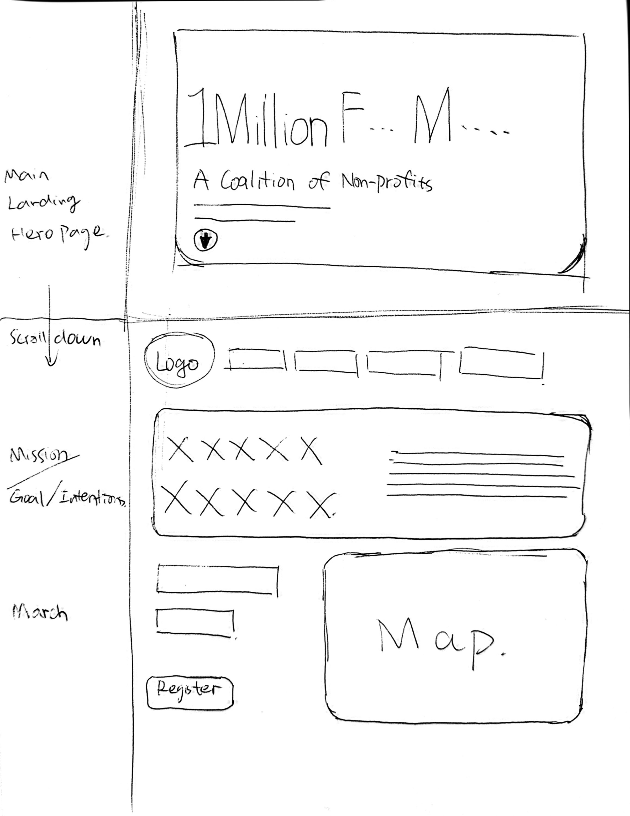
Based on our prior research and analysis, we decided to create individual wireframe designs for each webpage. After completing the low-fidelity designs, we presented three different concepts to the client. Incorporating the client’s feedback, we then refined our approach by combining the best elements from each design, resulting in a more cohesive and user-centric solution.
COLOUR & FONT
Based on the client’s color preferences, we developed a cohesive palette that evokes a warm, sunflower-inspired feel. To complement this, we selected clean and highly readable fonts, ensuring that the overall design conveys a sense of simplicity and professionalism. The chosen colors and typography work together to create a welcoming atmosphere while maintaining clarity and formality throughout the website.
Primary Color
#C05D06
Secondary Color
#C05D06
Secondary Color
#CD7E59
Alternative Color
#457373
Background
#F4EDD7
Text Color
#000000
Text Color
#4F4F4F
Text Color
#AEAEAE
Text Color
#E0E0E0
Text Color
#FFFFFF
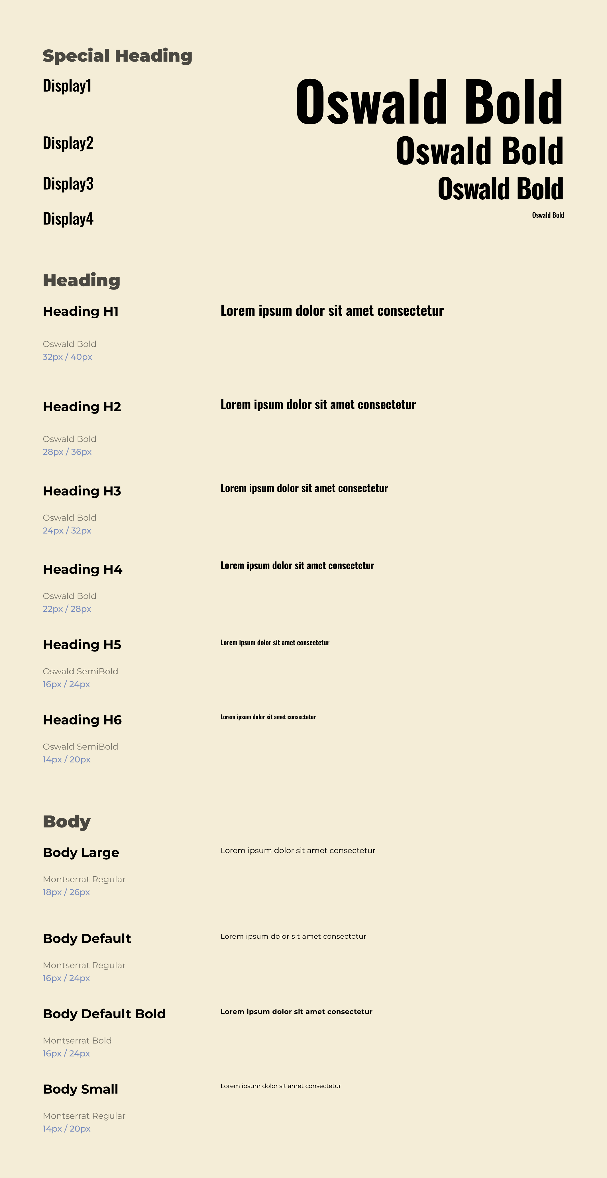
Design System
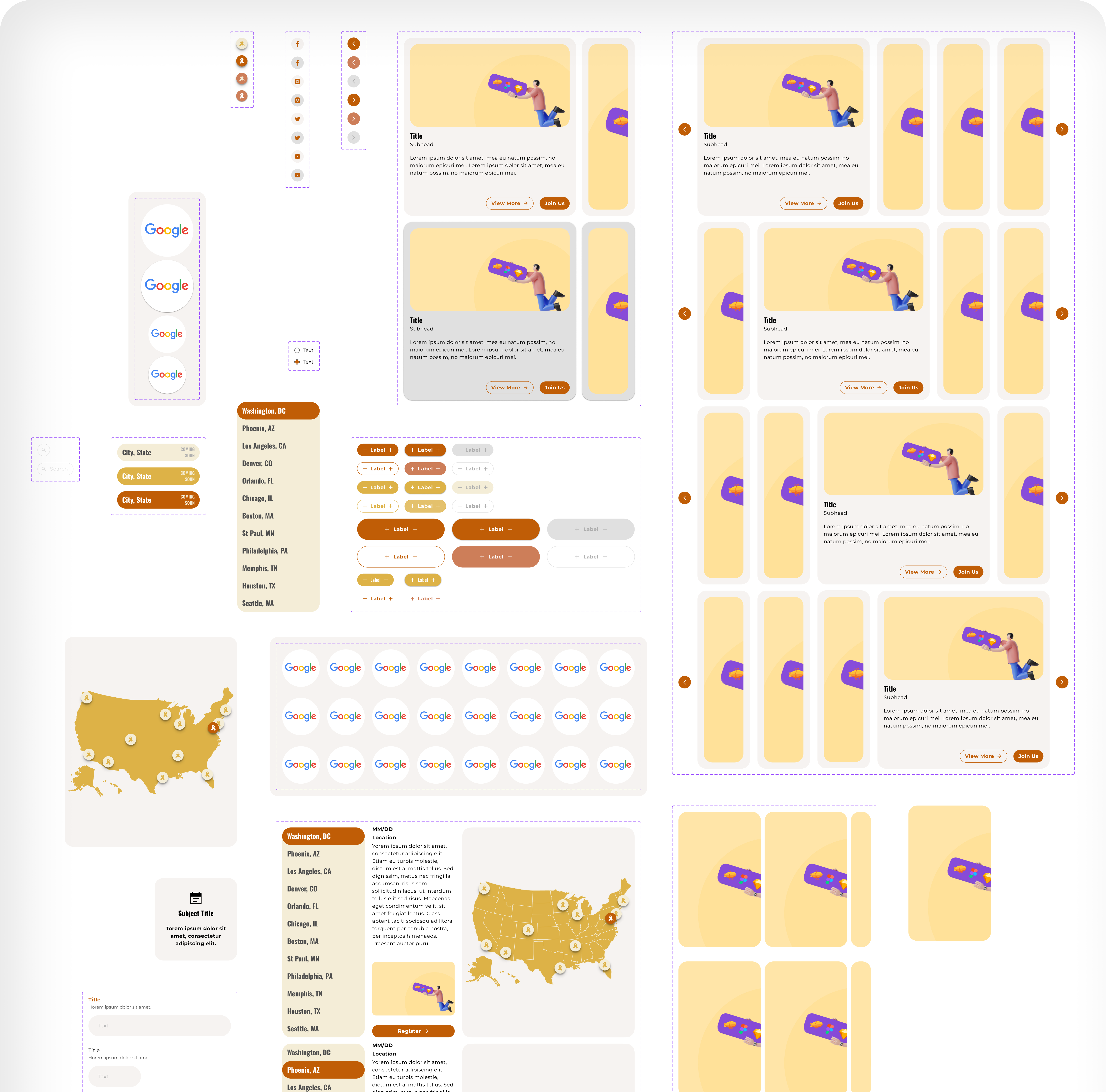
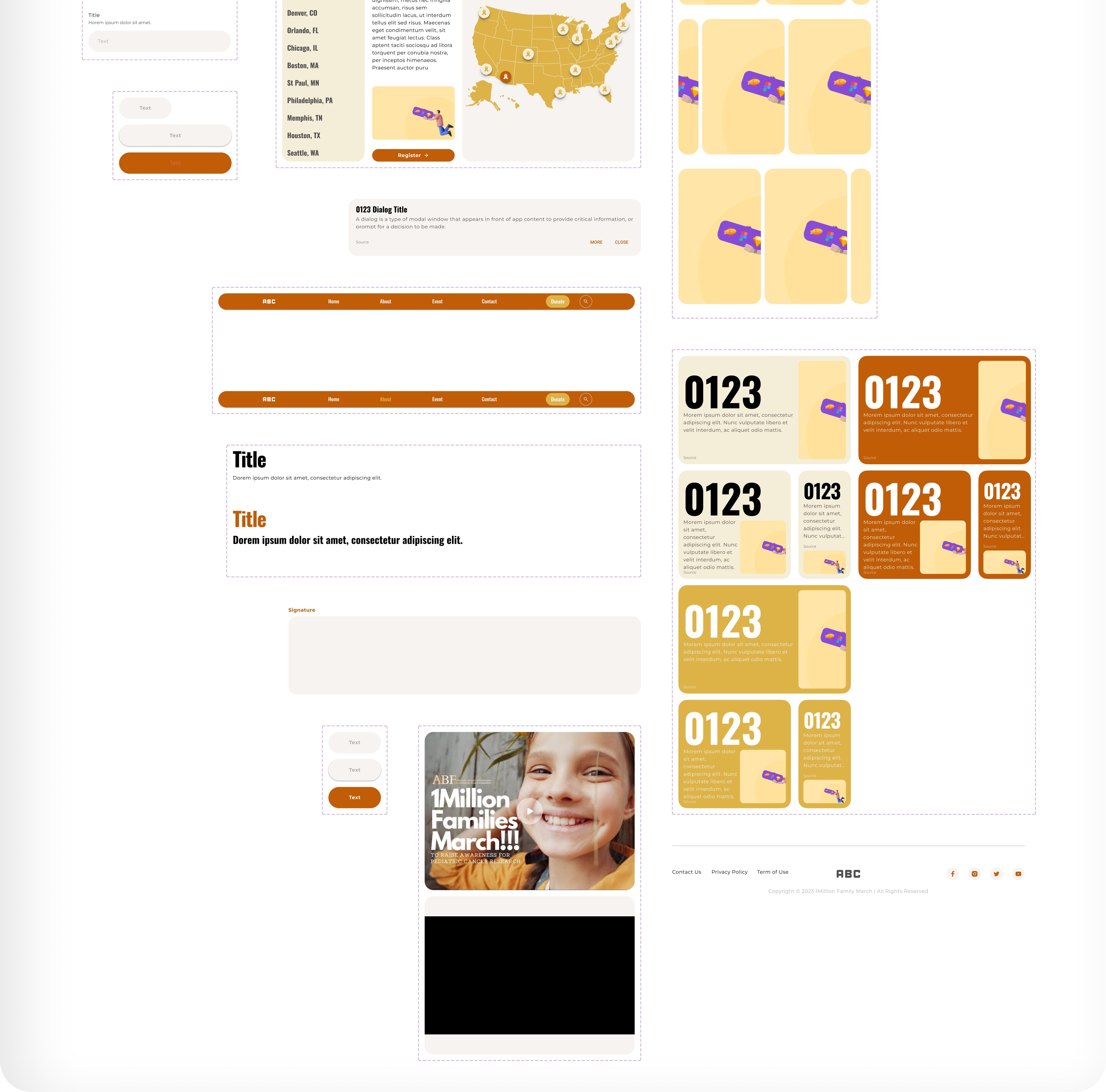
To ensure design consistency and streamline our workflow, Roy Yang and I developed a comprehensive design system. This system includes a wide range of components, such as buttons, footers, headers, and various style variants. It significantly improved our efficiency and served as a valuable foundation for creating animations and client-facing prototypes. The design system enabled us to maintain a cohesive visual style while speeding up the development process.
JOIN THE MARCH
Petition Join the March Support Us Sign Petition Change Future
Act now to change the future for countless children and their families. Please join us in the fight against pediatric cancer. Together, we can increase awareness and make a real difference for generations of children.
